


DOWN WE GO
DOWN WE GO
Markus Linderum makes big things happen in small spaces

Today’s review is about a rules-lite roleplaying game called DOWN WE GO. You may want to snag a copy to follow along! (It’s only $1 right now)
As I write this, there’s an itch jam running for this game. If you’re a game designer— or you want to be— this system is really easy to work with. I double dog dare you to make something for it.
The Team
Down We Go was really a group effort. It was written by Markus Linderum, developed by Tony Vasinda, edited by Walton Wood, illustrated by Simone Tammetta and the layout was done by Johnny Isorena. The book contains multitudes, not just in content but in contributors— it contains dungeons and details written by more than a dozen other talented people. Yet, somehow, they’ve managed to turn out something functional and cohesive. That’s incredible to me.
It really does seem like everyone on this team was passionate about the project, too. According to Simone’s twitter, their dominant hand was broken when they were first hired to draw the art for this book, so they learned to draw with their left hand!
I wanted to know how more about the game that inspired this brand of furious dedication, so I touched base with Tony, Johnny and Markus and did a quick interview.

Words From The Wise
Q) So I want to start off by saying this is a deceptively massive body of work. Ya'll fit an incredible amount into 72 pages without crowding out the pages. At what phase of development did you determine the scope of this project?
Tony: HA HA! It was a constant back and forth between Markus and I.
The original conception was a 12-20 page zine and it kept growing and growing. We ended up about 20 pages over what we thought we would have even when funding. I think the sweet spot was keeping the tech and design tight and below or at our 1 spread or less limit and then providing a Dsomething worth of examples. Had it been up to me It would have been 120 pages. If it had been up to Markus it would have been around 40 I think.
Markus: I’m so glad you didn’t listen to me. I agree, it’s a lot of material for that page count and Johnny did an amazing job with the layout.
Like Tony said, it was a constant back and forth where I was the one constantly saying “No more, we’re good now,” and Tony went “But it’s good stuff,” to which I replied “Hmm. Yes it is. Ok but that’s it,” and so it continued until we ended with the current page count.
Johnny really worked some magic, always thinking outside the box and coming up with ideas on how to make it all look good.
Tony: I'll add that Markus did some really great starting conceptual layout. Johnny certain tightened things, but the core game and the initial 4 adjective dungeon layout was something that Markus made and it gave us everything we needed to really let Johnny go to town with layout.
Johnny: From a visual and design standpoint, we had a really good starting point with Markus' material. We had a chance to build around and upon it without losing a semblance to the original art direction, which I loved because it felt really wet and organic. So we just took a lot of the elements from that and built the hierarchies from it. Another thing was the artwork from Simone Tametta which was so fun to work with. I think it complemented the art style perfectly, so we were able to make a lot of design decisions that made sense like the Infinopolis spread and the half-page character portraits. It was nice because we also were able to extend the use of the art even further, to social and digital where most of the assets were colored invertedly, and we had these dark pieces with stark white text and textures.
Q) Not only does it look good, but the layout really turns the OSR theme dial to 11! My first quick flip-through was like a nostalgic trip down memory lane. Can you tell me anything about that header font? It’s pulling a lot of weight where the general vibes are concerned.
Markus: The header font is called Ramundus and I think Tony researched it and it turned out it was based on rubbings made on old graveyards or something. I had it laying around for some time but when I started working on DWG I came to think of it and there really wasn't any other option.
Funny story... I thought some of the letters looked better in lowercase and some looked better in uppercase and I think it was a bit annoying for Johnny to always hear me ask stuff like "Are we really using lowercase there?" or "Shouldn't that be uppercase?"
Tony: We did have to settle on "Which version of certain letters to use," some are uppercase and others lower case because certain letters are very hard to decode after 7 centuries of visual drift.
Markus: That's a sport in itself, font searching! I guess like many or even most indie creators you scout the web for free stuff to use. Plus I'm a huge fontaholic to begin with.
Q) This might be one of the most easy-to-navigate TTRPGs I have ever picked up. The information is organized in a really logical way-- presented exactly in the order players need to access it. You have used EVERY SINGLE PAGE to its absolute greatest potential, too. The inside front cover pulls double duty as both a table of contents and credits, the inside back cover details guidelines for solo campaigns. I'd like to ask a bit about the touchstones (beacons) presented on the first "real" spread. How does one go about distilling something so sprawling and massive into a few short lines? It's a real art form.
Markus: Yeah what went where was also a bit of back and forth but as I recall it Tony had most of the ideas here, same with the beacons. He was able to put into words what the game was really meant to be all about, I guess from our playtests and our conversations.
Tony: Beacons were one of the last things we added. It actually took a while, and like a lot of other things in the book
It was a back-and-forth.
It has some hidden depth because it's built by using a non-evident formula.
Once I convinced Markus we needed them, I actually had him write them out and then I went back and rewrote them based on his thoughts. Then we talked about them and I did a final pass on them adding in what became the hidden formula.
Evocative Phrase
2 Sentence explanation and exploration of that concept and what it looks like at the table. This helps people mentally grab on.
-A point for Player Characters.
-A point for Referees
-A point for all of us.
None of the above is never explicitly explained (I don't know if I even told Markus about this) but it's designed this way to create flow and reduce cognitive load for the reader. We also had Walton Wood our amazing editor and members of the Plus One discord give input on this part of the process. But as Markus said, it was really about articulating what we had discovered in play and putting together our thoughts about the game.
The Most Critical Spread
Tony, Markus and I all agree— that beacons spread is one of the best in the book.
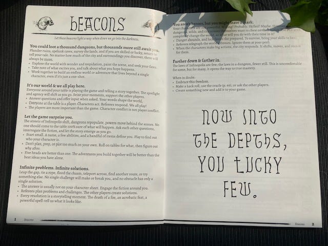
Tony was kind enough to give us the formula to write one of these during the interview, but I want to point out some essential details about the way this page is visually presented.
This spread lives where it belongs: right at the beginning, before the reader delves too deep into the details. It’s one of the first things you encounter as you open the book. I think that’s just a magnificent way to set the tone and expectations for the rest of the game.
I’m starting to think that any mid-to-large size game would really benefit from a touchstone page like this one.
Due to the sheer wealth of information crammed into this book, this spread stands out from a lot of the others because each point on the page is given a lot of room to breathe. There’s a decent amount of empty space— this allows the reader to peruse the page at a sort of leisurely stroll, allowing this honestly critical information to really sink in.
The skulls flanking the title herald every new chapter throughout this book. This is sometimes an unpopular opinion, but I’m a huge advocate for visual consistency. I think it makes Down We Go really easy to navigate without needing to reference the table of contents.
The last thing I’d like to point out about this spread is the font size for the body text. It’s big! Well, actually, it’s on the small side for my personal preferences, but trust me when I say the body text seems to get smaller as the book goes on!
Font Sizes Under Pressure
I just want to take a moment to point out that and there is a LOT of tiny font throughout Down We Go, and tiny font reduces legibility. Johnny and Markus clearly knew this when they took on the task of squeezing all this information into as few pages as possible, so I want to praise them for understanding the rules of design before they broke them.
As mentioned in the interview, this book started very small and grew well beyond expectations. The very idea of blowing 20 pages past a budgeted page allowance made my little heart tremble. Tony didn’t want to cut content, which meant something else had to give.
Nobody wants to read a big block of tiny text. It feels like work, and when we open a TTRPG it’s probably because we came to play. Tiny font thrives where you have a very little amount of information that needs to be not very visually distracting.
The character sheet is a great example of this:
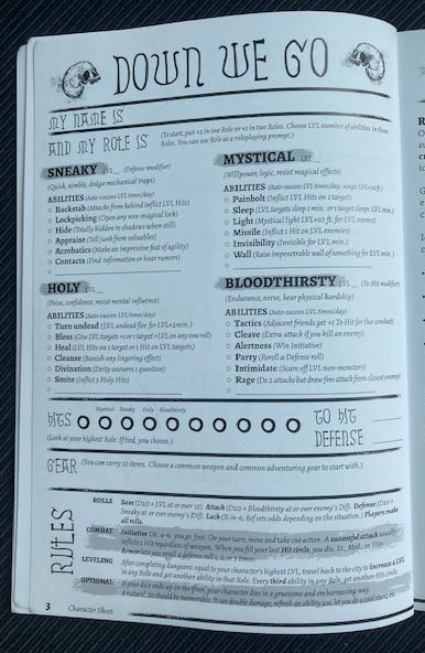
Every square inch of the page is being utilized here, because every function of a character is fully explained on this page. Yes, that means the page might feel a bit crowded, but it spares the designer from having to explain player actions on another page, and it means the player has an at-a-glance reference right in front of them as they play the game. That’s a trade-off I’ll gladly accept.
Further into the book, tiny fonts continue to make appearances in the tables, but Johnny NEVER uses a tiny font to explain core rules or essential information, so the reader never has to labour to read any given page. This was a job well done.
Physical Copies
As you may have noticed at the top of this review, a PDF of Down We Go can be easily acquired on itch. I’m more of a hands-on kind of guy, so I prefer to hold the books in my hands. My copy is a perfect bound softcover with coated interior paper and a soft-touch cover. Oooh. So fancy.
I swear I picked up a damaged copy but I genuinely couldn’t tell you where the damage is. After two or three days of flipping the pages all of my zines look worse than the way this arrived.
There’s also a hardcover edition if you’re big on the way things look on your shelves. I can’t deny it’s nice to be able to read the title on the spine.
You can get your own copy at Plus One Games.
That’s All For Now
Thank-you, Markus! Apes of Wrath makes really cool stuff, I’ve been a fan of yours for ages.
Thank-you, Tony! Plus One provides so many invaluable resources to the community, it’s impossible to measure the impact you’ve had so far.
I also want to apologize for the long silence. I was very sick, but now that I’ve recovered we’ll be returning to our two-week cycle.
Thanks for reading.
Regards,
Justin Vandermeer
Nice interview and write-up on your thoughts on the book! Love this kind of stuff.
Excellent interview - I just ordered the hardback!